Website design is a delicate art that goes far beyond aesthetics. It involves a complex interplay of various elements, one of the most critical being colour. The psychology of colour in website design is a fascinating field that delves into how different colours can evoke specific emotions, influence user behaviour, and ultimately impact the success of a website. In this deep dive, we will explore the intricate relationship between colour and psychology and how it plays a pivotal role in creating a captivating and effective website.
Understanding Colour Psychology
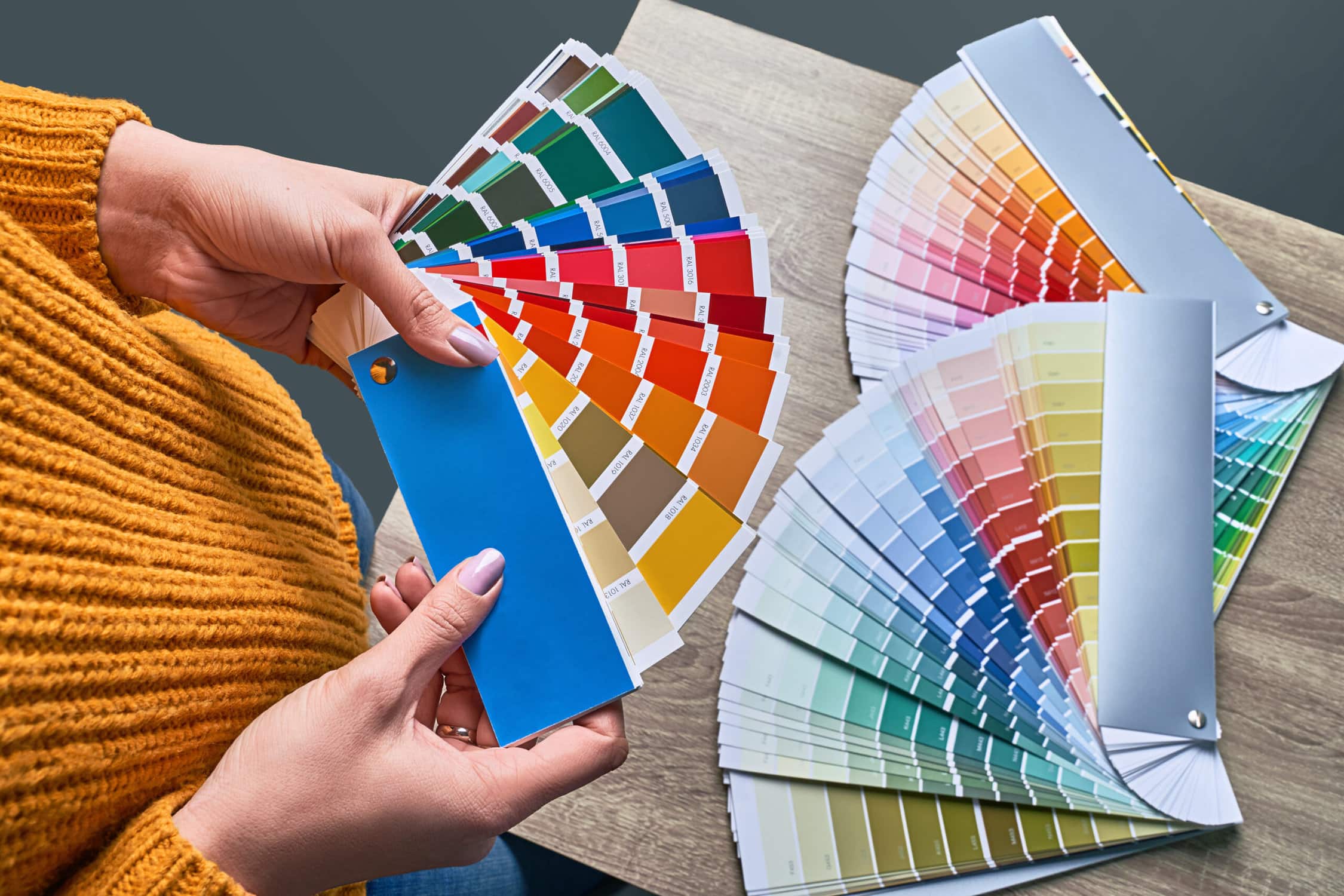
Colour psychology is the study of how different colours affect human emotions, perceptions, and behaviours. It’s a multidisciplinary field that draws from psychology, design, and marketing to uncover the ways in which colours can be used strategically to achieve specific goals. Here are some key concepts in colour psychology:
- Colour Associations: Different colours are often associated with specific emotions and meanings. For example, red is commonly linked to passion, excitement, and urgency, while blue is associated with calmness, trust, and professionalism. These associations can vary across cultures and contexts.
- Colour Harmony: Creating a harmonious colour palette is essential for a visually appealing website. Harmony involves selecting colours that work well together, either through complementary, analogous, or triadic colour schemes. Well-designed colour palettes can enhance the overall user experience.
- Colour Contrast: Effective use of colour contrast can draw attention to important elements on a webpage, such as calls to action (CTAs). High contrast between text and background, for example, improves readability.
- Cultural Considerations: Colours can have different cultural connotations and meanings. What’s considered lucky or unlucky in one culture may not hold true in another. It’s essential to be mindful of cultural sensitivities when designing websites for a global audience.
The Role of Colour in Website Design
Now that we have a foundation in colour psychology, let’s explore how colours play a crucial role in website design:
- First Impressions: The colour scheme of a website is often the first thing visitors notice. It sets the tone and conveys the website’s personality and purpose. For instance, a healthcare website may use calming blues and greens to in still trust, while a fashion brand might employ vibrant colours to create excitement.
- Brand Identity: Consistency in colour usage helps establish and reinforce brand identity. Think of Coca-Cola’s iconic red or Facebook’s blue. These brands have successfully associated specific colours with their products and services.
- User Engagement: Colours can guide user attention and behaviour. CTAs, for instance, are typically in contrasting colours to encourage clicks. Similarly, error messages may be displayed in red to convey urgency.
- Emotional Impact: The emotional impact of colour is significant. Warm colours like reds, oranges, and yellows can create a sense of urgency or excitement, while cooler colours like blues and greens promote calmness and trust.
- Accessibility: Ensuring that a website is accessible to everyone is paramount. This includes considering colour choices that accommodate users with colour vision deficiencies. Websites should maintain good colour contrast for readability and clarity.
Strategies for Using Colour Effectively
Now that we understand the significance of colour in web design, let’s explore some strategies for using colour effectively:
- Understand Your Audience: Consider your target audience’s preferences and cultural backgrounds when selecting colours. Different demographics may have different associations with colours.
- Create a Colour Hierarchy: Use colour to guide users’ attention to the most important elements on your website. For example, use a bold colour for call-to-action buttons to make them stand out.
- Maintain Consistency: Stick to a limited colour palette to maintain a cohesive and professional look. Consistency in colour usage helps build brand recognition.
- Test and Iterate: Don’t be afraid to experiment with different colour schemes and gather user feedback. A/B testing can help determine which colours are most effective in achieving your goals.
- Consider Accessibility: Ensure that your colour choices meet accessibility standards. This includes providing sufficient contrast for text and background colours to accommodate users with visual impairments.
In conclusion, the psychology of colour in website design is a powerful tool that can influence user behaviour and perception. By understanding the emotional and cultural associations of different colours and employing effective design strategies, you can create websites that not only look visually appealing but also engage and resonate with your audience on a deeper level. Colour is more than just aesthetics; it’s a means of communication in the digital world.